My responsibilities
Game design:
Designed and iterated on player character control mapping, tuning inputs based on playtesting feedback
Collaborated across art, sound, programming, and design on features throughout production
Tracked gameplay issues as they surfaced and proposed solutions in collaboration with QA
Planned and executed player tests with the QA team, analysing results to inform design decisions
Level design:
Prototyped the overall world layout during pre-production, evaluating competing designs before carrying the chosen direction into engine
Created the initial blockout in Unity
VFX:
Designed and implemented visual effects including the morphing menu screen figures, in-game fires, forcefields, and player impact sparks
Design issue examples
Issue 1 - Controls

Result:
A control scheme that made sense based on how soon each element is needed ingame and was viewable via the menu.
Problem:
Players were confused by the intial control setup
Solution:
I tested different control setups and based on feedback decided on the one players found most intuitive
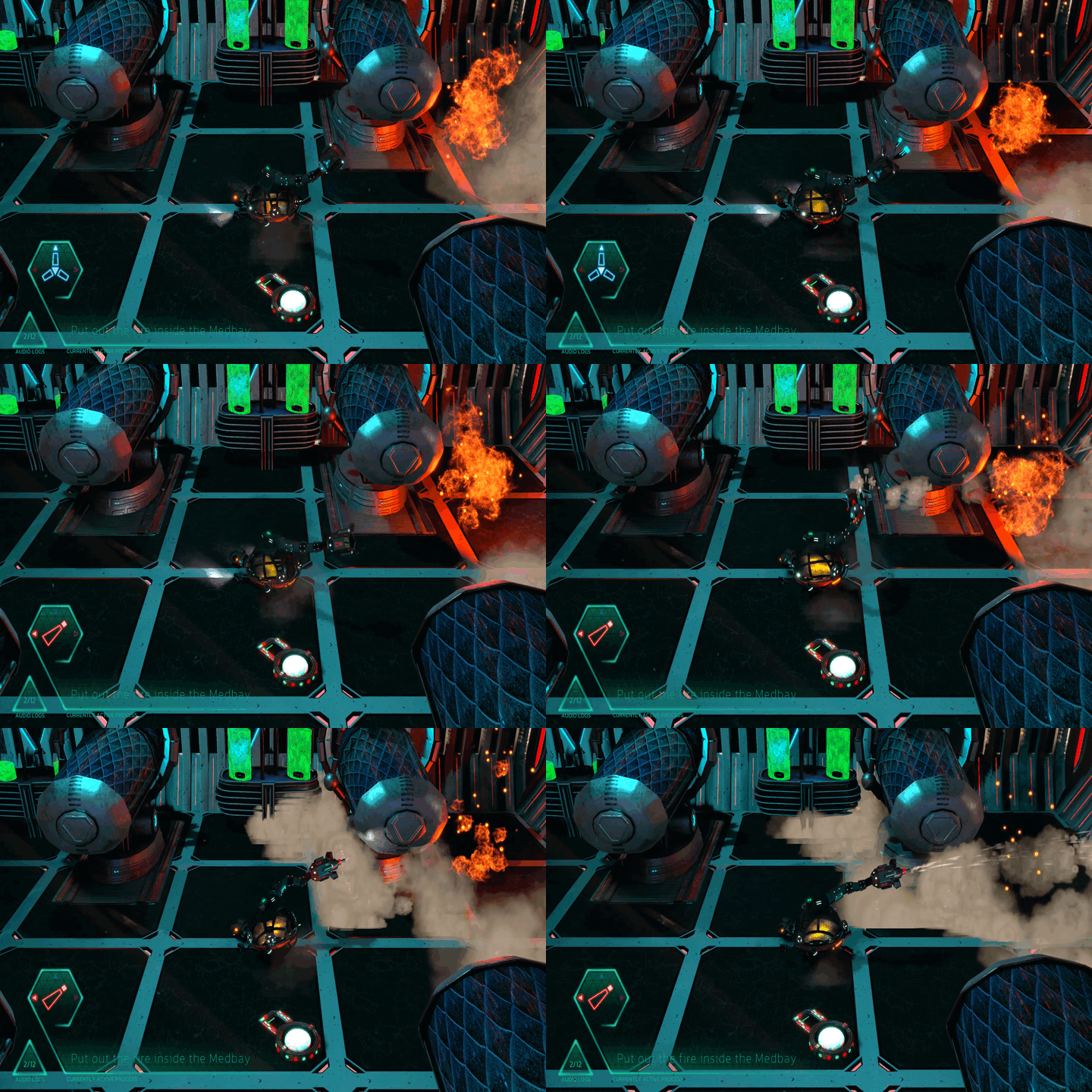
Issue 2 - Attachments
Result:
Better feedback to the player led to a smoother gameplay experience
Problem:
Players initially had difficulty remembering which attachment was active as soon as their character had picked up more than one.
Solution:
I worked with an artist and a coder to provide better feedback to the player via a UI element (lower left) as well as color match it to the attachment on the character
Issue 3 - Navigation
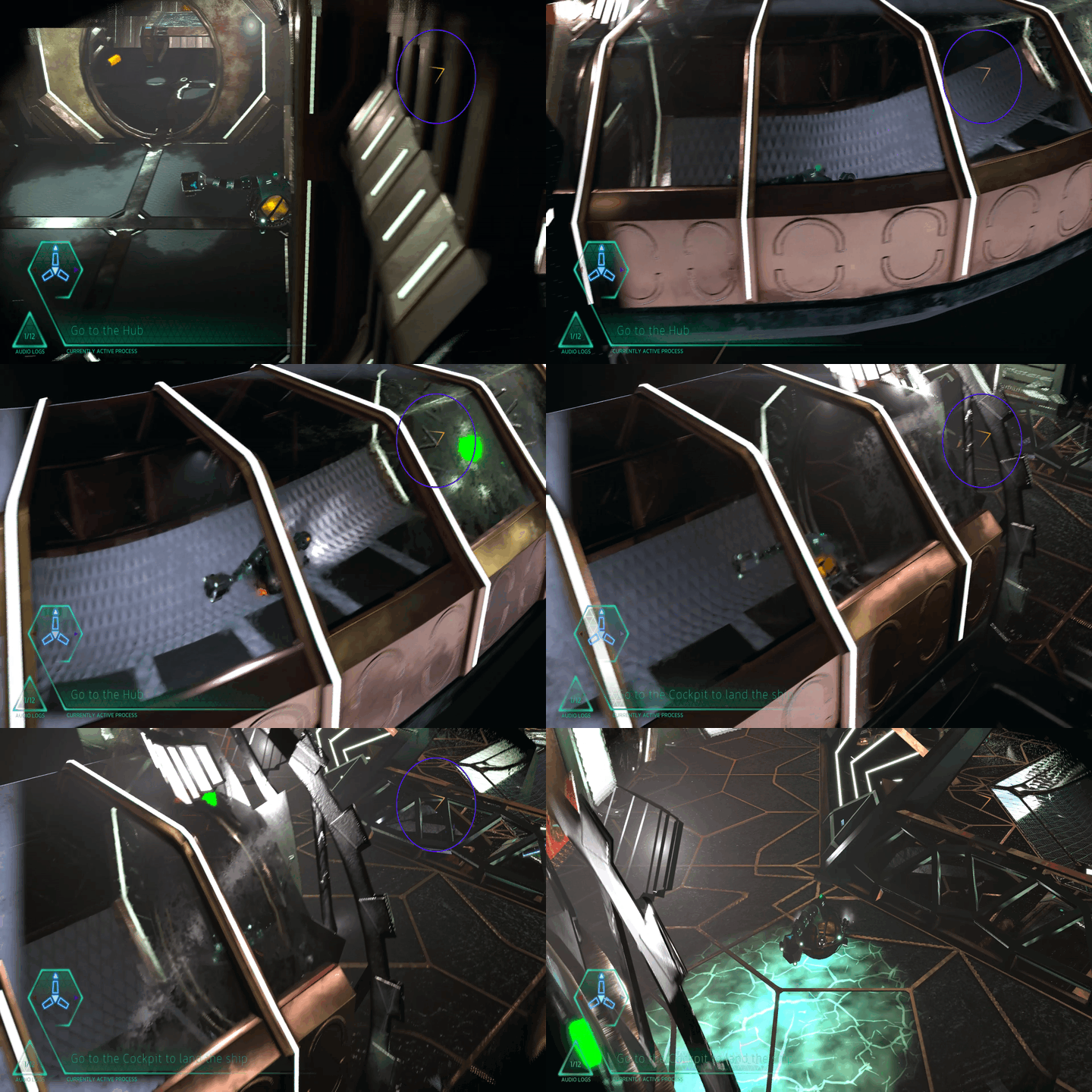
Result:
The visual indicator made moving around the ship more frictionless for the players. (Purple circle used to mark on the gif, the circle is not present ingame)
Problem:
Players got easily lost trying to figure out where to go on the spaceship
Solution:
I suggested 3 potential solutions for the team. UI map, an ingame element showing an overview of the ship, or a visual marker pointing towards next objective.
Lessons learned
Unfamiliar worlds need more guidance than familiar ones. When the game's setting uses symbols and signage players have no prior reference for, the team's accumulated knowledge becomes a blind spot. The stranger the world, the more deliberate the guidance needs to be.
QA data is a designer's best argument. Having statistics behind a proposed change makes it significantly easier to get others on board. Gut feeling alone rarely is enough.
Test early, test often, test with external people, never stop testing.
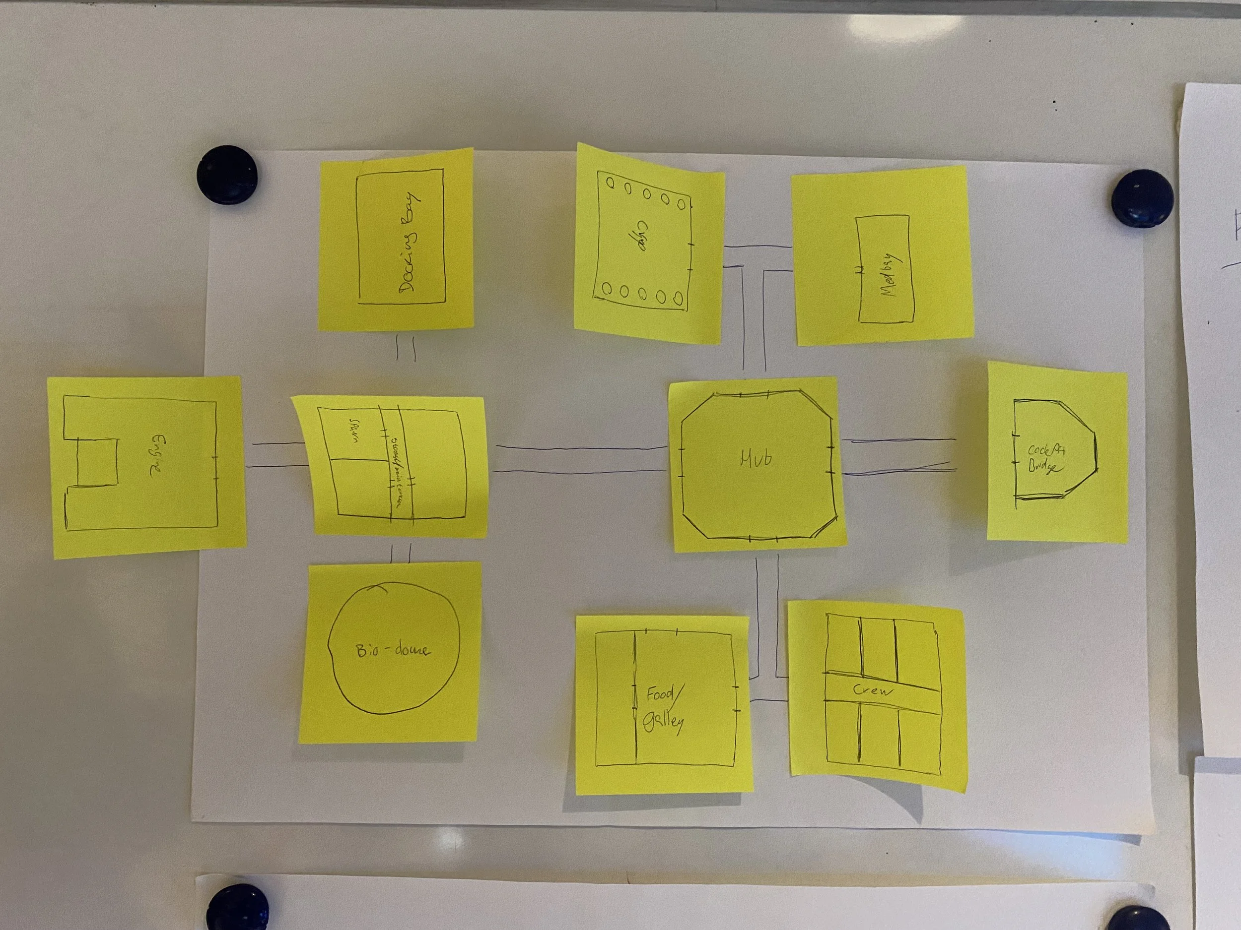
A brief walk through the level design
1st step:
We mapped out the world using sticky notes — one per room, with a rough shape sketched on each. Low-fi on purpose. It let us visualise the full layout at a glance, move things around quickly, and argue the pros and cons of each arrangement without getting precious about it.
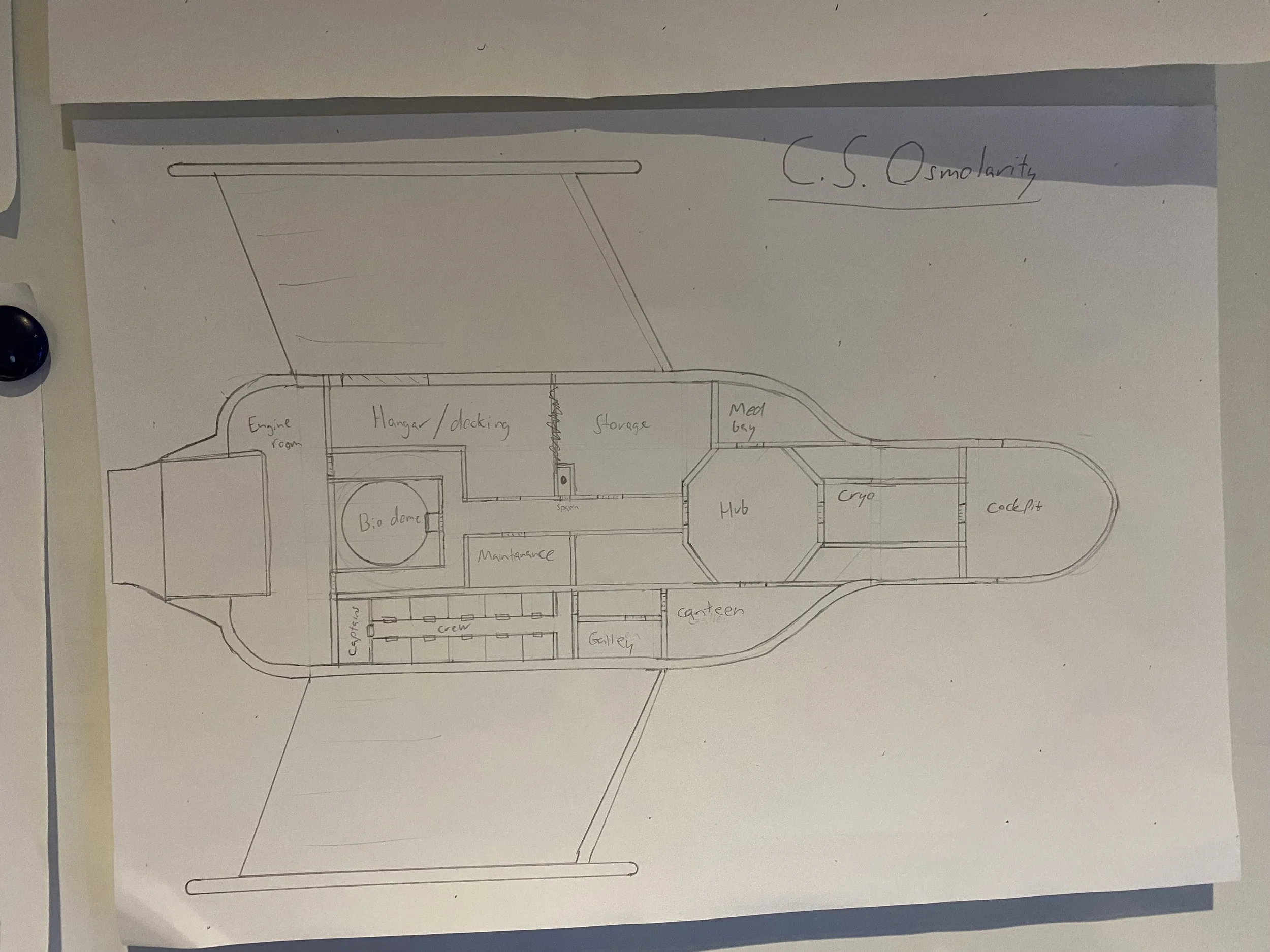
2nd step:
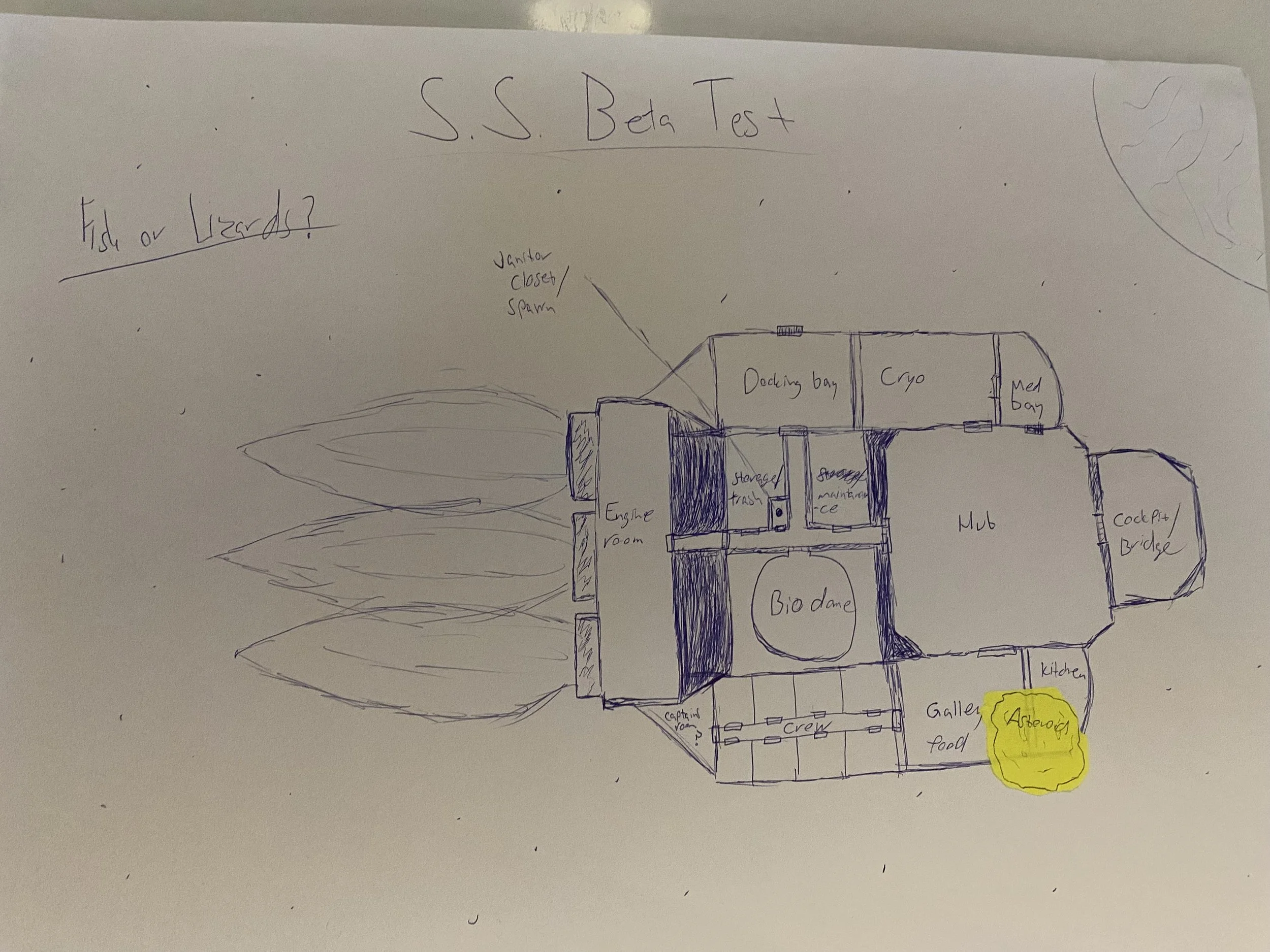
With the strongest room ideas identified, we explored different spaceship silhouettes to see how those rooms could fit together. Each shape was a test of how well the layout could support both the design and the narrative we wanted to tell.
3rd step:
Neither of the two layouts made the final cut - the art director brought a third option that the lead group went with. But the process earned its keep: working through those designs made it clear which rooms were lower priority and which were load-bearing for the experience. The biodome and canteen got cut. Everything else made it into the final game
